We've just about got our heads around the Firefox development process. There's Firefox Beta and Firefox Aurora, the beta and alpha builds, and then there's Firefox Nightly, where the first stages of testing occur.
Firefox Nightly is so named because developers make changes to the code during the “day”, and then at “night” a fresh build is uploaded to the Mozilla servers for developers and hardcore enthusiasts to test. It’s important to know at this point that many of the code changes have not been tested – they’ve been incorporated into the main build, but that’s it. It's now up to the hardy souls who run Firefox Nightly to try out the changes and report back on any stability issues they encounter.
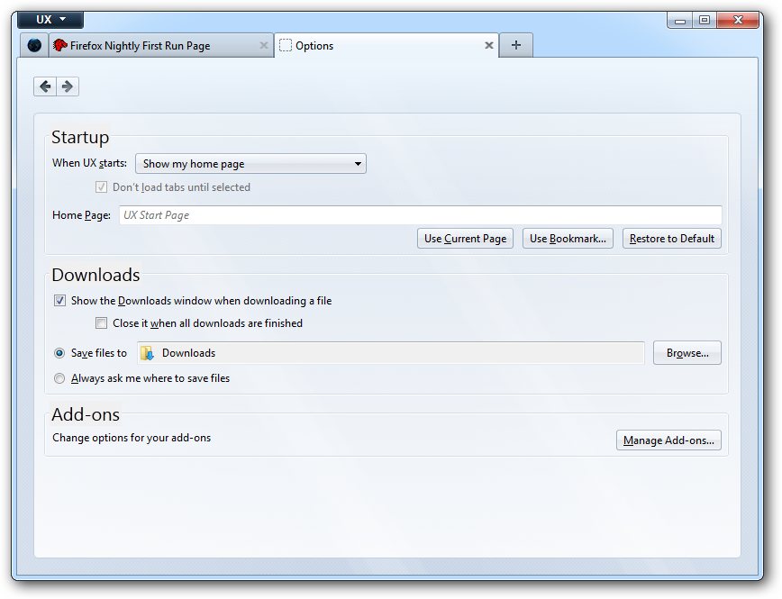
Somewhat confusingly, there's a second nightly build - Firefox UX - where mooted changes to the program's user interface are coded and then tested. It presumably makes sense - a group of developers concentrate on the look and feel of the program, and changes can be merged into the main Nightly channel or even Aurora when they're considered ready for testing ahead of primetime.
The UX build will install alongside other Firefox builds, including the other Nightly build as well as Aurora and the Beta/Stable build. However, it will share access to existing Firefox settings, meaning there is a risk you could lose these if something catastrophic was to happen.
With this in mind, we’d strongly recommend you only install Firefox UX on a test machine, or in a virtual environment such as that provided by VirtualBox. Once done, you can safely road test it, secure in the knowledge you’re not going to screw up your main computer by doing so.
In August, 2011 Mozilla previewed a number of significant changes to Firefox's user interface, most of which we like. And in Firefox UX, you can start testing these changes for yourself, with the vast majority now in the process of being implemented.
These include a streamlined top part of the browser, with forward and home buttons removed by default. Also missing are the Address and Search bars when you switch to a pinned web app tab, such as twitter.com.
The Download Manager has also been revamped – when you start downloading a file, it’s no longer displayed in its own window; instead, a download icon appears in the top right-hand corner of the Firefox window: click this to see a list of recently downloaded files.
Finally, there’s also a new Tab page, which displays a list of bookmarks and recently visited web sites in place of the traditional blank page. It all adds up to a radical overhaul of the Firefox interface, and you can preview it now.
Verdict:
Firefox UX offers a tantalising glimpse into how future versions of Firefox will look and operate - although it's not for the faint of heart.


Your Comments & Opinion
Get the latest, untested version of Firefox while it’s still warm
Get the latest, untested version of Firefox while it’s still warm
Get the latest, untested version of Firefox while it’s still warm
Get the latest, untested version of Firefox while it’s still warm
Take a glimpse into the (relatively speaking) far future of the Firefox browser
Windows-only browser aimed at the gaming community
A desktop email client for Windows
A speedy web browser with a focus on security and privacy
A speedy web browser with a focus on security and privacy
A new browser for power users from the co-founder of Opera